Thursday, May 27, 2010

From Drawing to Painting (2)

Color concept

Before I start with my painting I try to come up with a color concept first. For this piece I've got a very clear idea in my head. The oven is going to be the main lightsource in this piece. It is a wam light. To let the warm color be the most dominant I'm going to put the rest of the piece in a cooler color. This should create a clear focus point for the viewer.

Blocking in the color concept


So here is the result of the 1st idea I had for this piece. I tried to put in a warm color, orange/yellowish, for the lightsource. This lighting should bring out clearly the girl sitting in front of the oven. The rest of the kitchen is in a cooler purple/blueish color, so the girl gets the most attention. Keep it simple, not go into details, and try to keep my light and shadow clearly separated.

Critique/suggestions?

Now the trick in this stage is too look at your own work with a fresh pair of eyes. Try to look at it if you see it for the first time, is it working? What do I really see?
I am noticing a few things that need work.

First is that the oven and the girl have the same color. They both ask for your attention. I wanted the girl to be the first thing you see, that is not the case now.

Second thing I notice is that it is a little hard to see that there is a girl sitting. How she sits, her posture isn't working with this lighting. If she would be sitting more in front of the oven, I think, she would come out better.

Changes

So I am going to make some changes. I think the most important thing to change is the position and the pose of the girl sitting in front of the oven. I think coming up with a better silhouette for the girl, will improve the piece. I also have to think about the lighting while designing the new girl.

So back to the drawing board!

Wednesday, May 26, 2010

warm & cool colors

What are considered warm colors and what are cool colors?

Is orange the warmest color, and is blue the coolest color? So does this mean that when a color contains more orange than blue, it is a warmer color, and if it contains more blue than orange, it is a cooler color?


This leaves me with some questions.

1. Is there also a cool orange color, or a warm blue color?
2. What is color temperature then exactly?

From Drawing to Painting

For the last 10 years I have been drawing and painting. I love it. I tried water color, crayons, spraycans, acrylics, ink, ecoline, silkscreening, and since a year or 2 I focus on digital painting. So I've tried all mediums, worked really small on paper, produced big high murals and always I get the same response, when people see my work and then see my sketchbook...

" I like your sketches better."

So the question I would like to solve is, how can I make succesfull paintings out of my drawings?

Well the first step, maybe, could be, stick to your drawing. When a drawing has the right energy, you decide to make it into a painting. Now the trick is, how to preserve that energy that is in the sketch, and put it also in the painting?

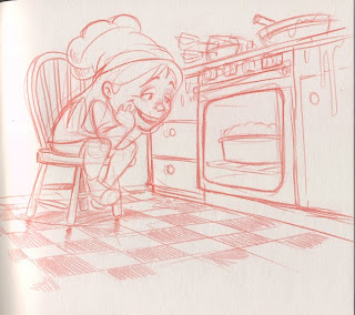
So let's start with a drawing from the sketchbook. It's like a 10 min sketch.


and this is how I will start my painting.


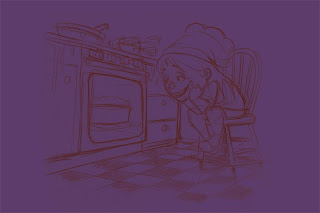
I start with a base color, on top is my sketch, flipped, so it reads better I think, and I gave it some more space on the canvas.
That's it for now, so let's start painting.

Saturday, May 22, 2010

Color

Color is a subject you can study and evolve in your whole entire life. It is hard to understand and get a grip on, at least for me that is, and the only way to learn, I think is to practice, so to paint a lot, and make a lot of mistakes. Also you can become more conscious about what you are doing by writing it down. So here are some thoughts on my approach to color, things I try to focus on while westling with color and a some links to material I study to get a better understanding of color. I know color and value go hand in hand, but this is just about color itself.

One thing I try to do is to use the level of saturation in my color to guide the viewers eye. This means that the main focuspoint of my story contains the most saturated colors. Everything that is secundair for the story is less and less saturated. Simplified I pick my saturated color from the right side of the line, and my less saturated colors from the left.


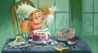
Another thing I try to do is to approach the whole scene with one general color 'feel' and start painting from there. So for example in this piece I thought the oven and the girl are telling the story. They are going to consist of warm saturated colors, a yellow-orangish color. It is the focuspoint of the story. Therefore I started the painting with the complemantary color of that, a purplish colder color.


This leads to the next thing I try to be aware of while painting and that is color temperature. I think this means warm lights, cool shadows, and vice versa. And for instance using complementary colors in a dress that is, say it is green , then there can be reds in the shadow of the dress. The goal is, I think, to make your colors richer, not by adding black and white to the color, but by adding color to it, you can intensify the color.

The first book I ever read about color was Kleurenleer by Johannes Itten. This was about 10 years ago, when I was in art school. At the studio I've watched this DVD like a gazillion times, in the hope of understanding color and light a little bit more. And of course the internet can also provide you with some interesting feedback about color (and value). A really interesting video I saw recently was by artist Marco Bucci. In this video he talks painting fundamentals.


But the only way to really learn and understand is to do it yourself. So paint, make mistakes and learn from them.

Saturday, May 8, 2010

Sunday, May 2, 2010